Your pick comes down to how steady your hand is with a pen that can’t be erased: cursive is one continuous stroke, so every hesitation shows up as a dark blotch, while a custom sign with short words hides a wobbly line much better.
If your control is still shaky, start with ruled pencil guides and straight strokes, like the ones in a custom sign, then work up to the curves of cursive script.
1. Custom Wood-Burned Signs
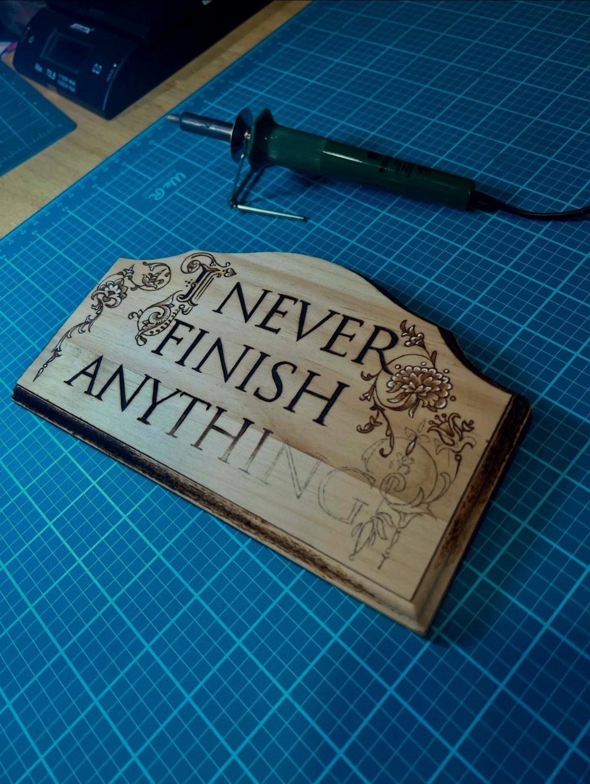
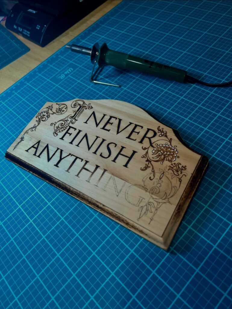
A plaque with a short phrase and a few burned flowers around it is a good first sign. Short words give you fewer letters to get wrong, and the florals can hide a slightly wobbly line.
Pencil the whole layout first, spacing letters by eye and checking that the words sit level. Burn the lettering before the flowers so the flowers can fill any gaps.
Pick a phrase that means something to the person getting it. That’s what makes a plain board a custom sign.
2. Gothic Style Wood Burned Lettering
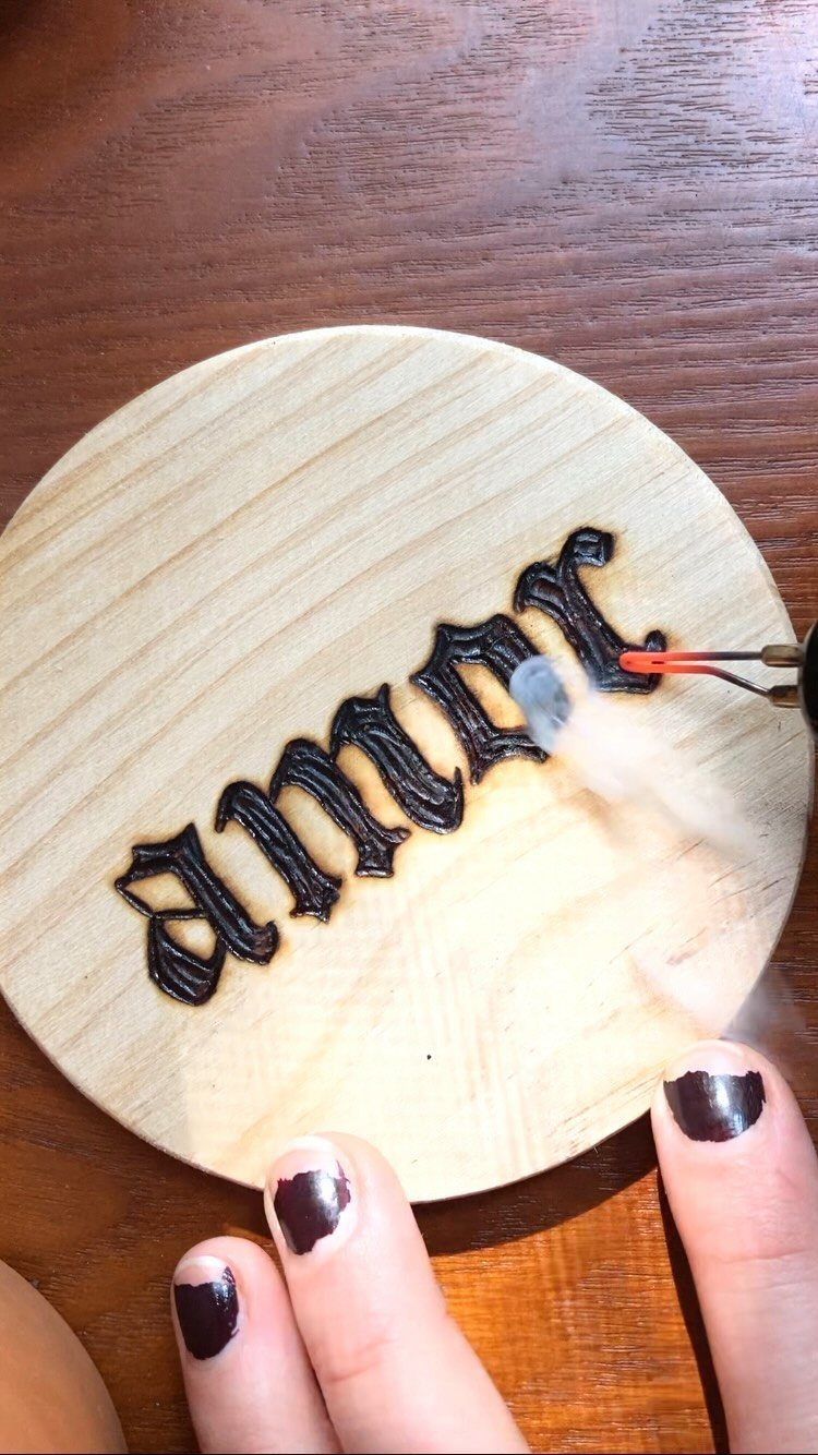
Gothic lettering suits wood burning because its thick downstrokes and thin hairlines are built from straight, deliberate strokes. A round plaque adds a twist: the words have to curve with the edge.
Draw guidelines in pencil, plus a center mark, before any heat touches the wood. Burn the thin lines first, then go back and fill the thick strokes by tracing 2 parallel lines and shading between them.
Light wood gives the black strokes the most contrast. Go slowly; gothic forgives little, and one slip shows.
3. Cursive Script Lettering
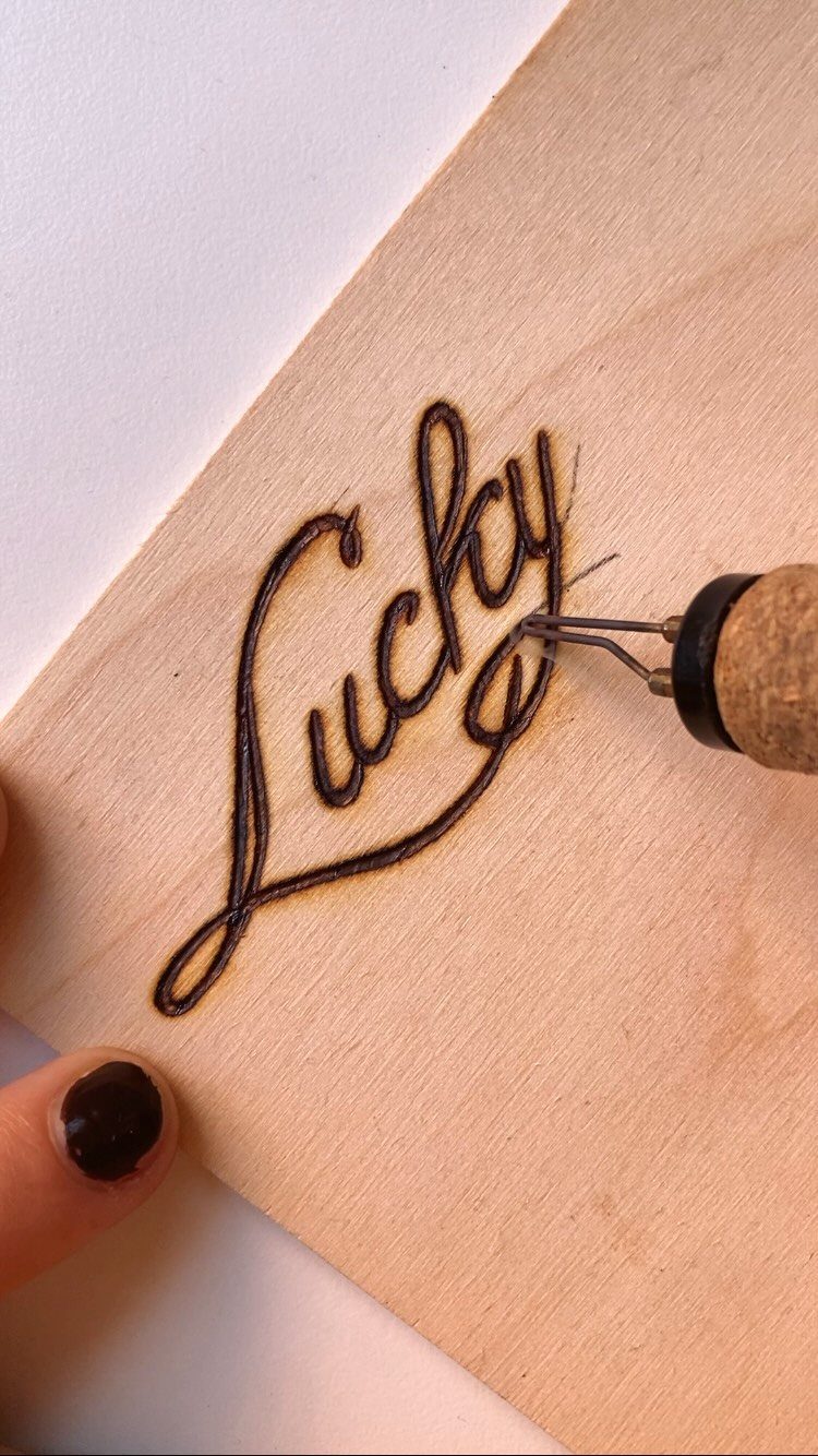
Cursive is the one style where I’d tell a beginner to practice on scrap first. A word like "Lucky" needs one continuous, even stroke, and any hesitation shows up as a dark blotch.
Sketch the word in pencil, then keep the pen moving at a steady pace. Pull the tool toward you rather than pushing it.
To get that classic look, press a little harder on downstrokes and lighten up on the upstrokes.
Short words on a light board like basswood or birch plywood make the easiest start for cursive, since a pencil guide shows clearly and every burn mark stays easy to read.
4. Wood-Burned Portrait with Text
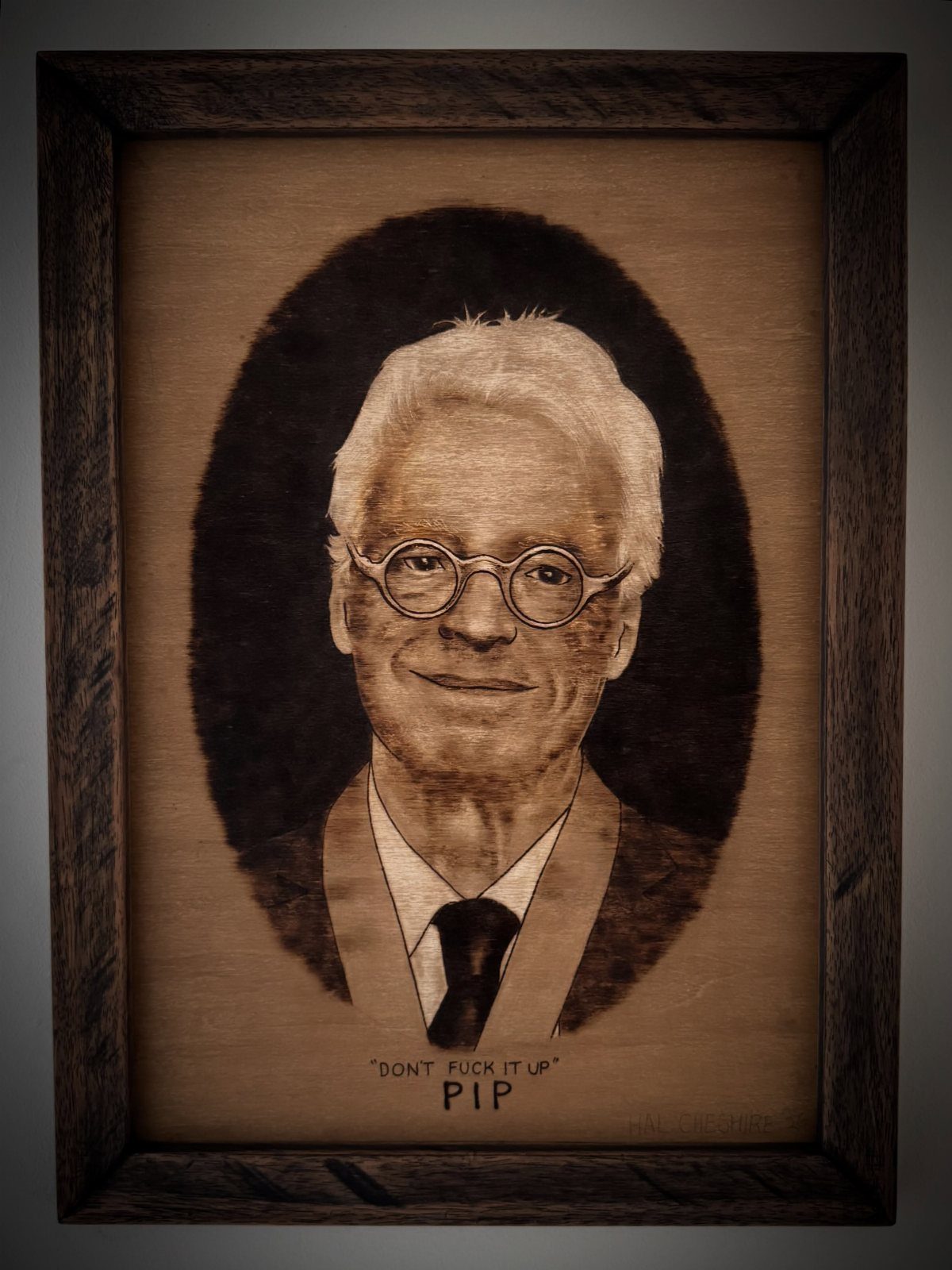
A burned portrait with a line of block lettering beneath it turns a plaque into a character study. The text can carry the humor or the name, while the face does the heavy lifting.
Start with the portrait, since it’s the harder part, and save the block letters for last. Block lettering is forgiving: ruled pencil lines and straight strokes keep it tidy.
Leave enough room under the face so the words don’t crowd it. A simple frame keeps the finished piece looking intentional.
Frequently Asked Questions
What’s the best wood for wood burning art?
Light, smooth wood like basswood or birch plywood is my pick.
The pale surface gives burn marks the most contrast, and a pencil guide stays easy to see before you burn over it. That combination makes lettering easier to read and to correct.
What are some tips and tricks for wood burning?
Practice on scrap wood first, especially before cursive, where any hesitation leaves a dark blotch.
Pencil your whole layout before the tool heats up, and pull the pen toward you at a steady pace instead of pushing it. Different techniques call for different approaches, so match your strokes to the style you’re burning.
What is pyrography?
Pyrography is the art of decorating wood by burning designs into its surface. Lettering, flowers and even portraits can all be done this way with a heated pen.
How do I burn lettering into wood?
Sketch the words lightly with a soft pencil before the tip gets hot, adding guidelines and a center mark if the text will curve. Then burn over the pencil with steady strokes.
How can I make wood burned cursive look good?
Keep one continuous, even stroke and don’t stop mid-letter, since pauses show up as dark spots.
For classic cursive, add a little pressure on each downstroke and ease off on the upstroke so the line swells and thins. A short word on light wood is the easiest place to start.